/ PROJECT · DOT FURNITURE
DOT Furniture
A spring campaign for a Canadian outdoor furniture retailer, treated with editorial language instead of retail.

The context
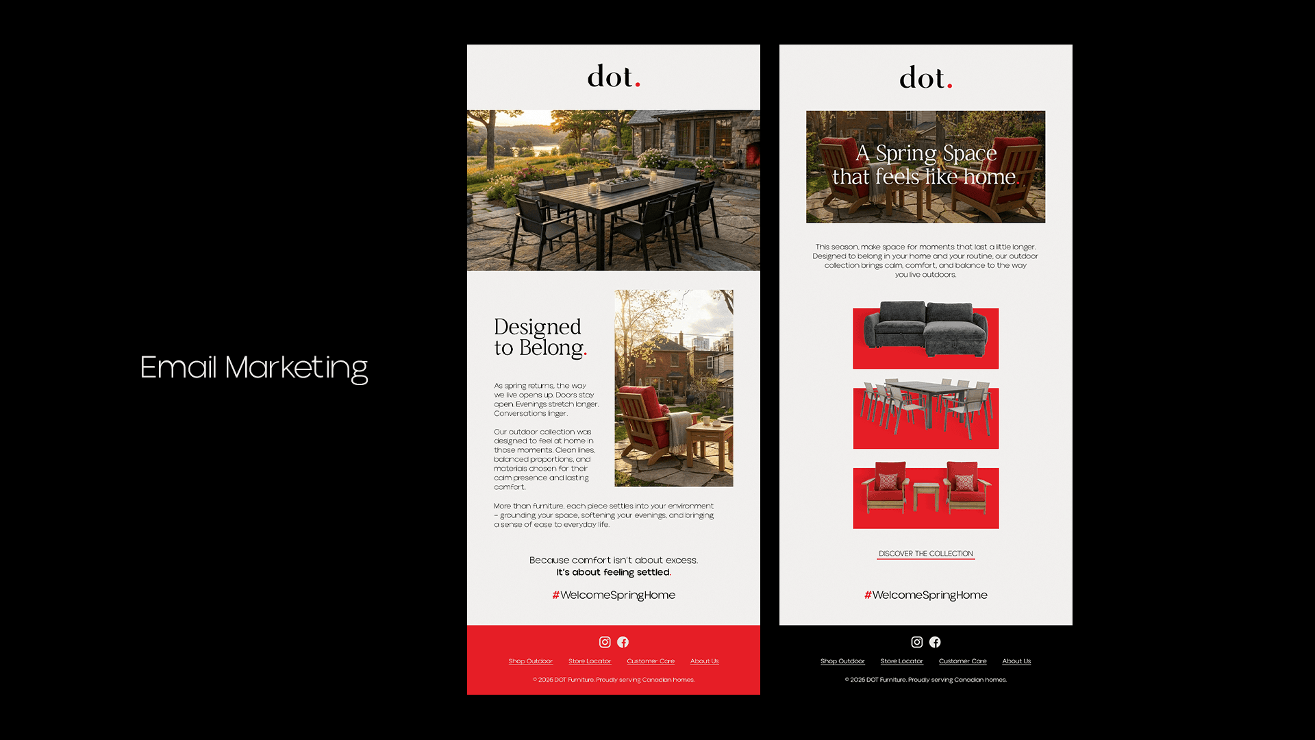
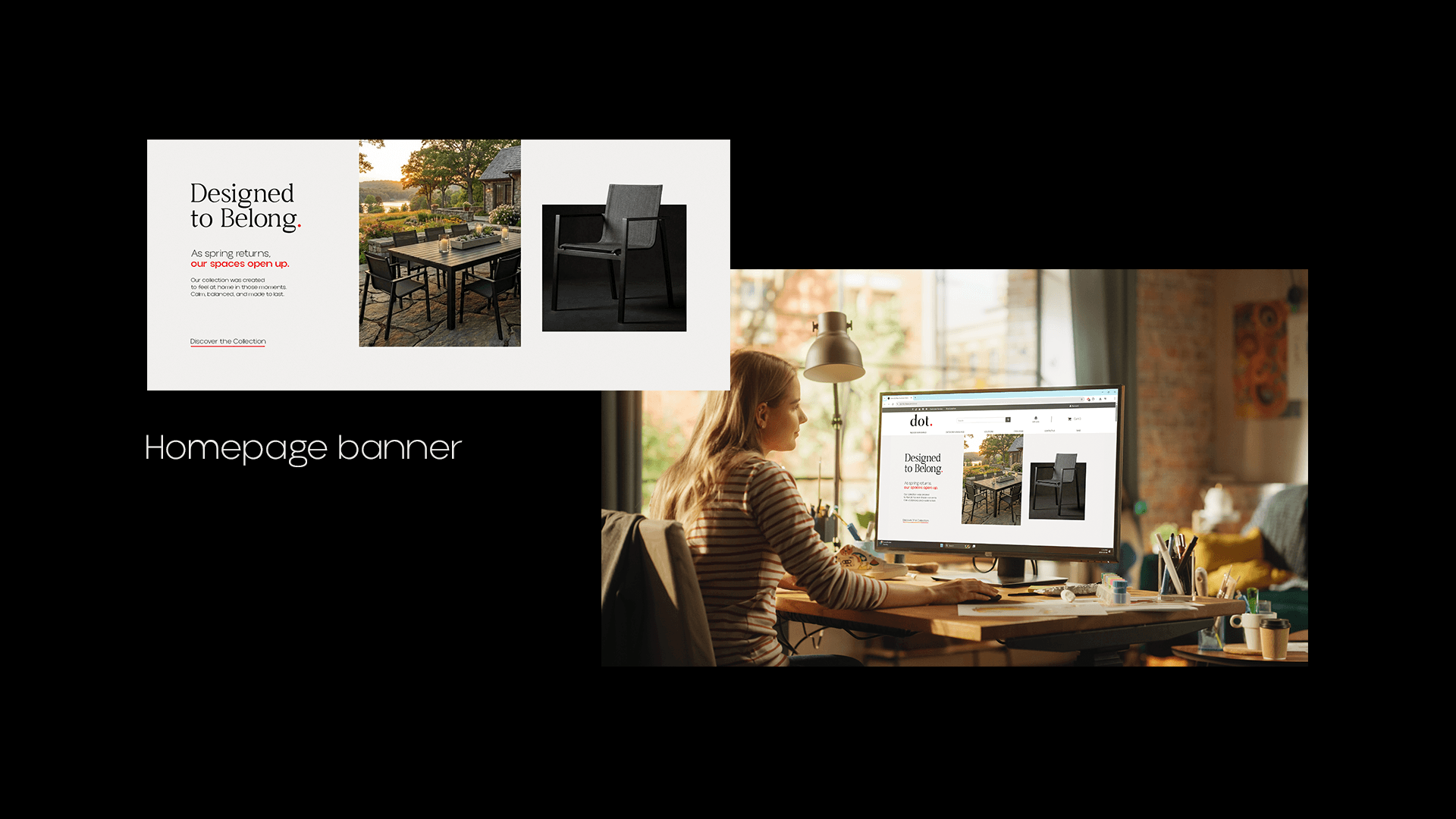
The initial request was small: a homepage banner and a campaign email. But the brand sits at the top of Canadian outdoor furniture retail, and the supporting material didn't match that positioning.
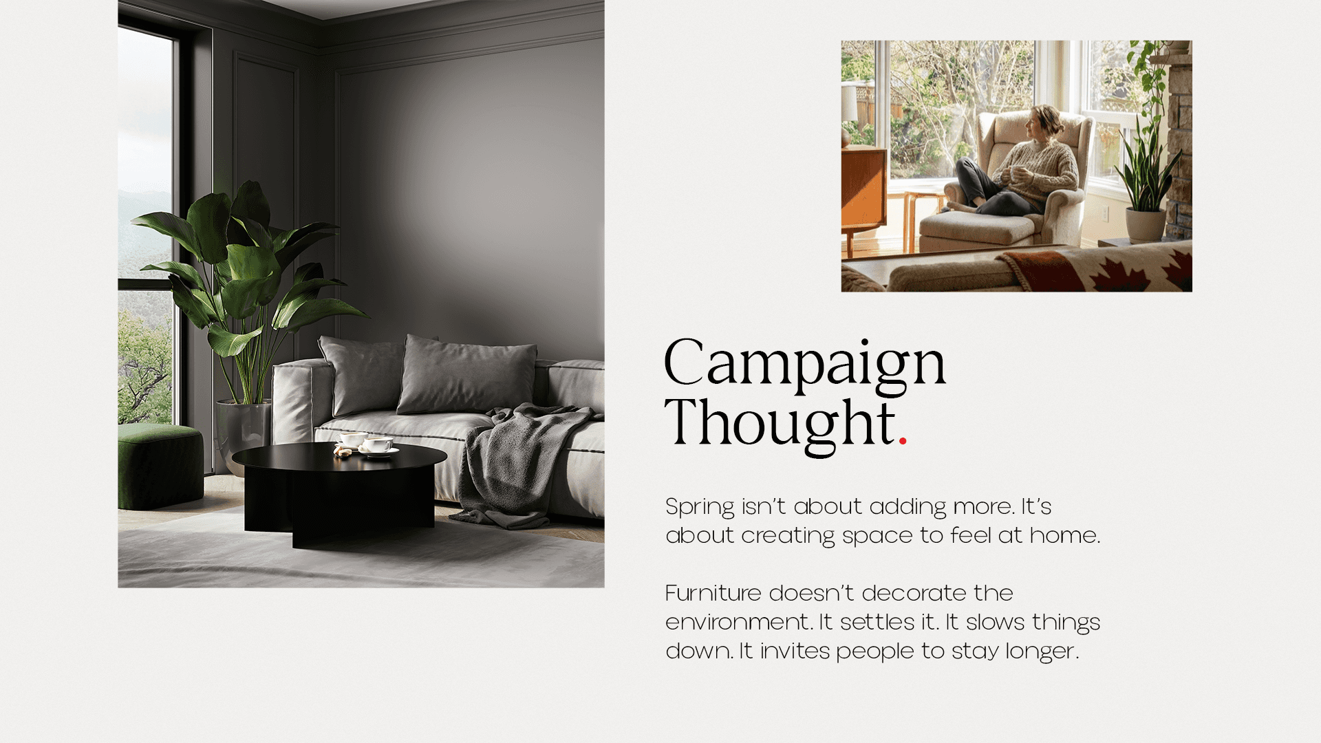
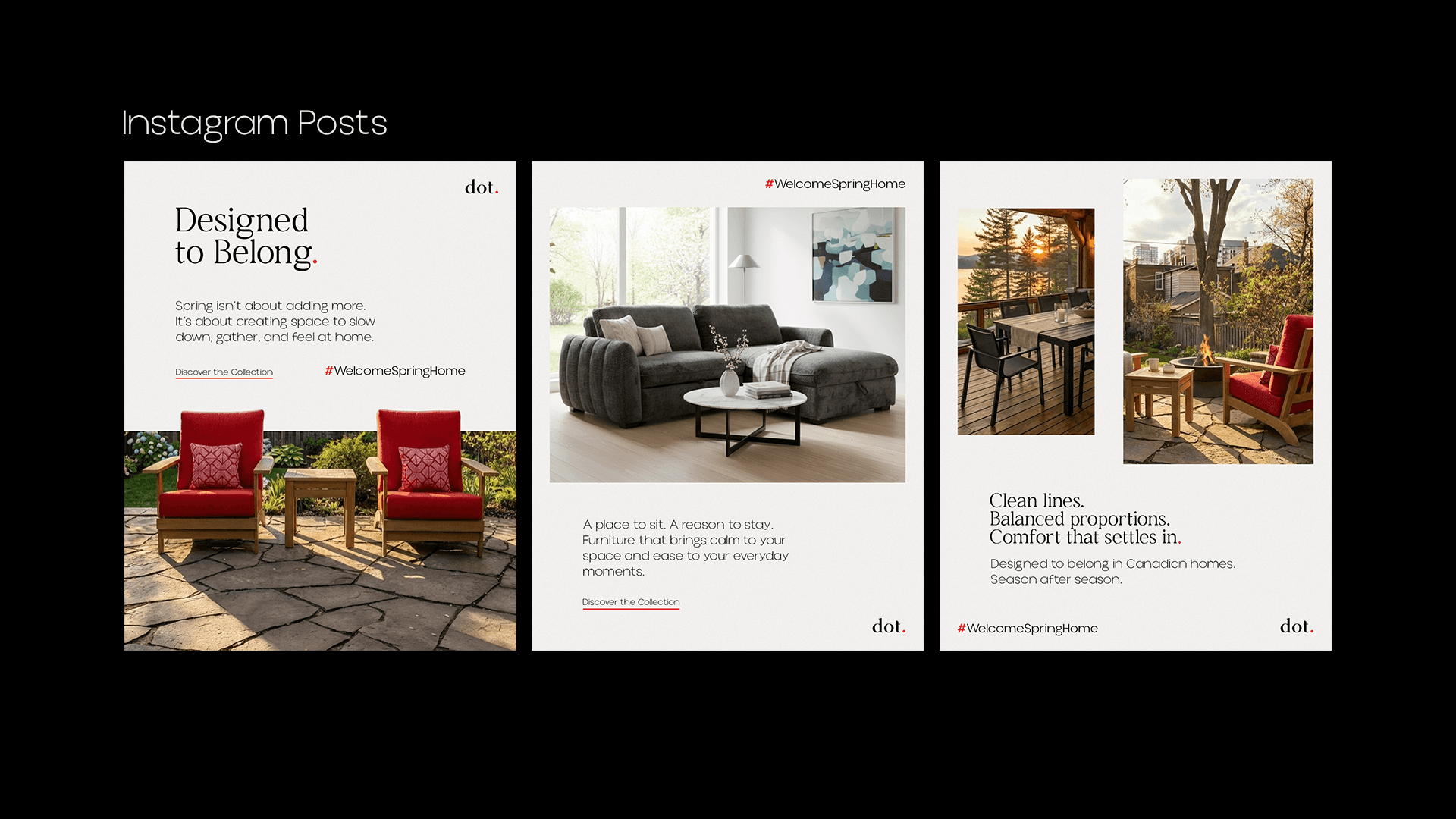
Instead of delivering the two pieces in isolation, we expanded the scope and designed a short, complete campaign with spring as the common thread: the season when people take back the outdoor areas of their homes.
What we did
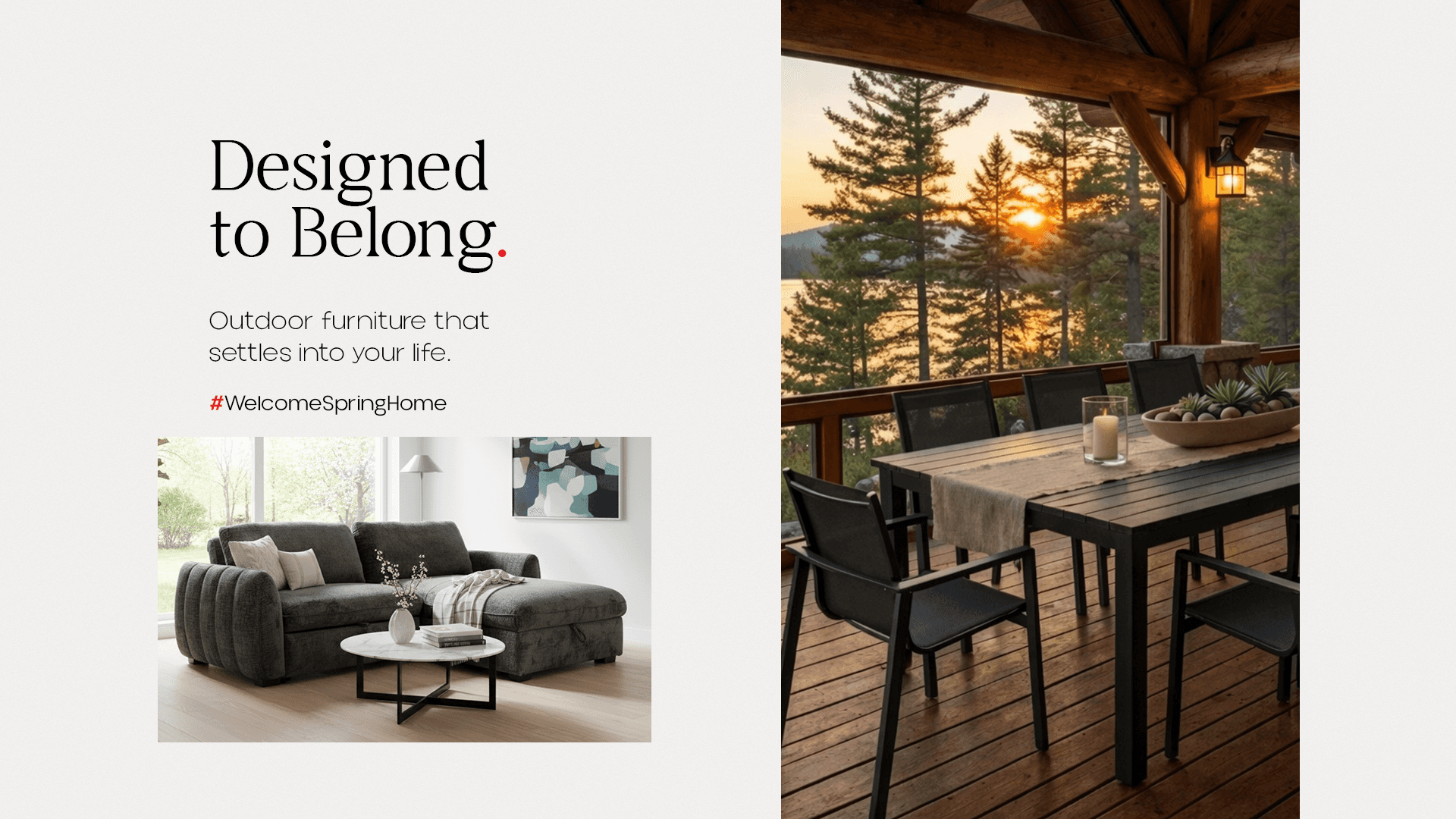
We adopted an editorial language: plenty of white space, serif typography, restrained compositions and photography treated as environment, not as catalogue. The furniture appears inside a scene, not cut out on a neutral background.
The brand's red dot became a recurring signature, appearing at a different scale and position in each piece, which gives the campaign unity without repeating the logo everywhere.