/ PROJECT · RIVIVERE
Rivivere
Repositioning a hair care brand: from functional product to botanical well-being with an air of quiet luxury.
The context
The brand communicated function, meaning what the product does, and left out the philosophy behind it: restoration, scalp health and sensorial care.
The 'natural' territory in hair care is saturated and predictable: leaves, earthy tones, organic typography. Repeating that repertoire would mean disappearing on the shelf and in the feed.
What we did
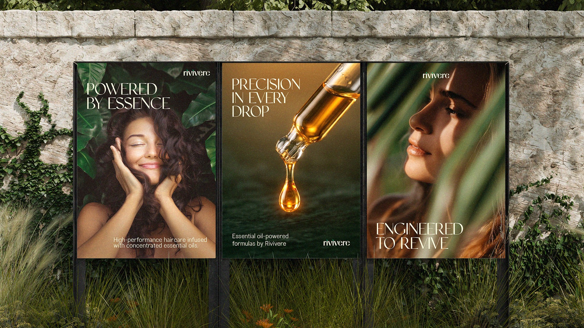
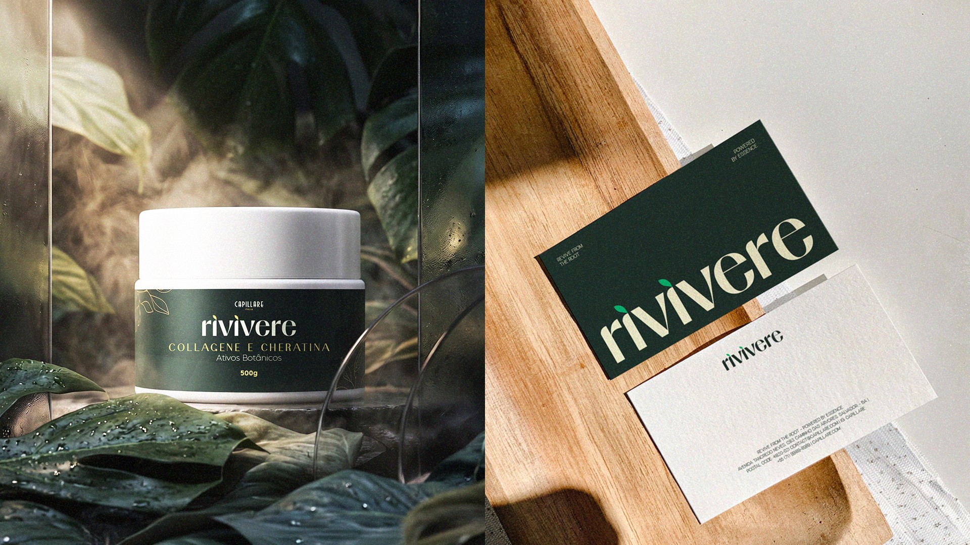
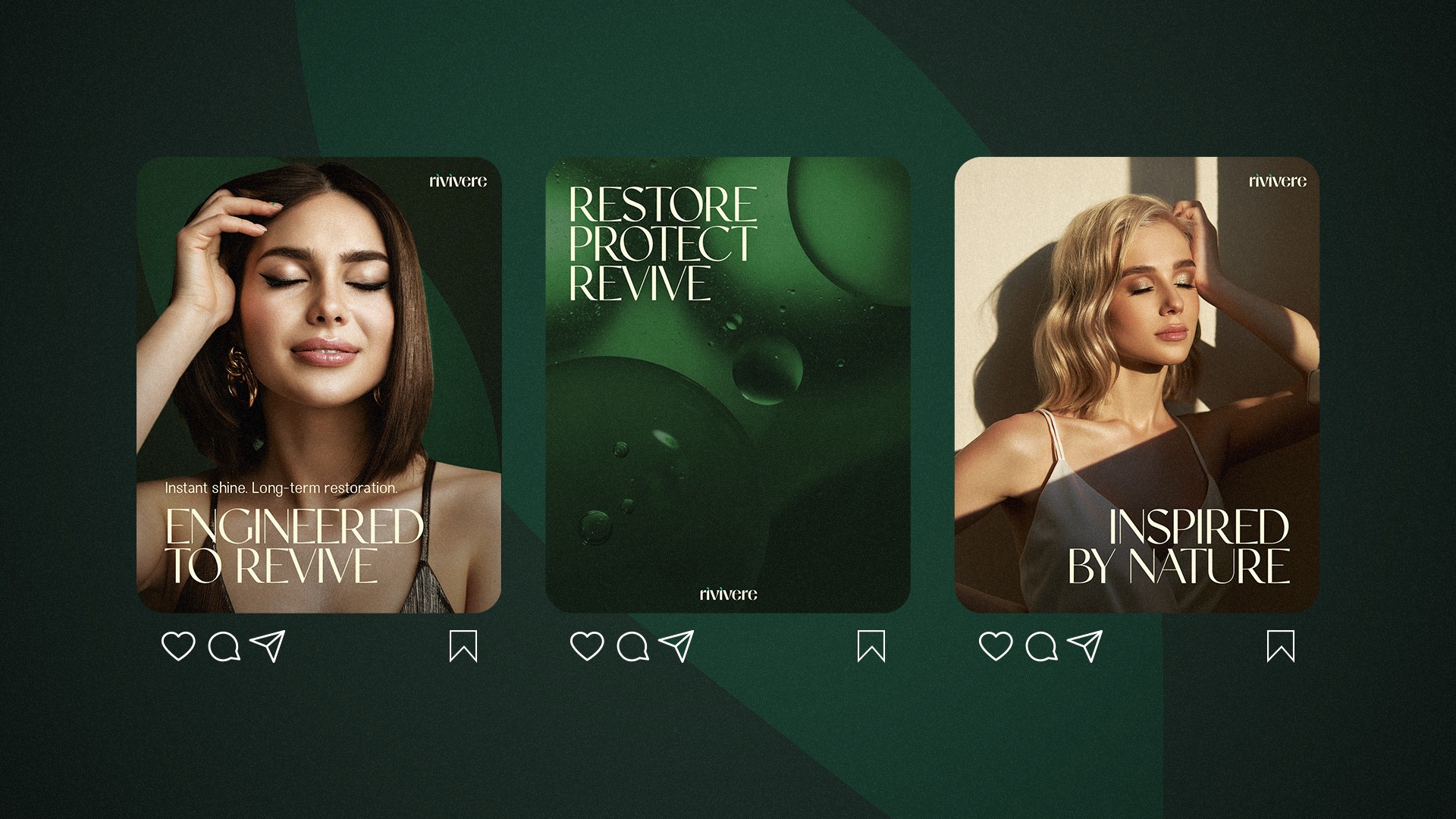
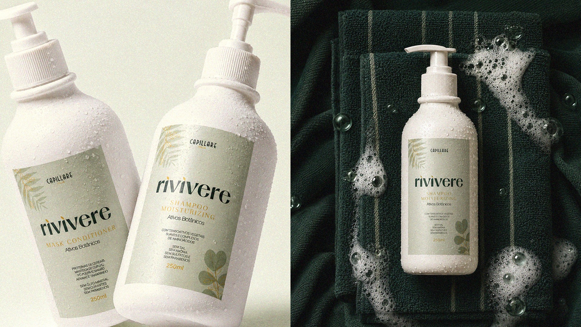
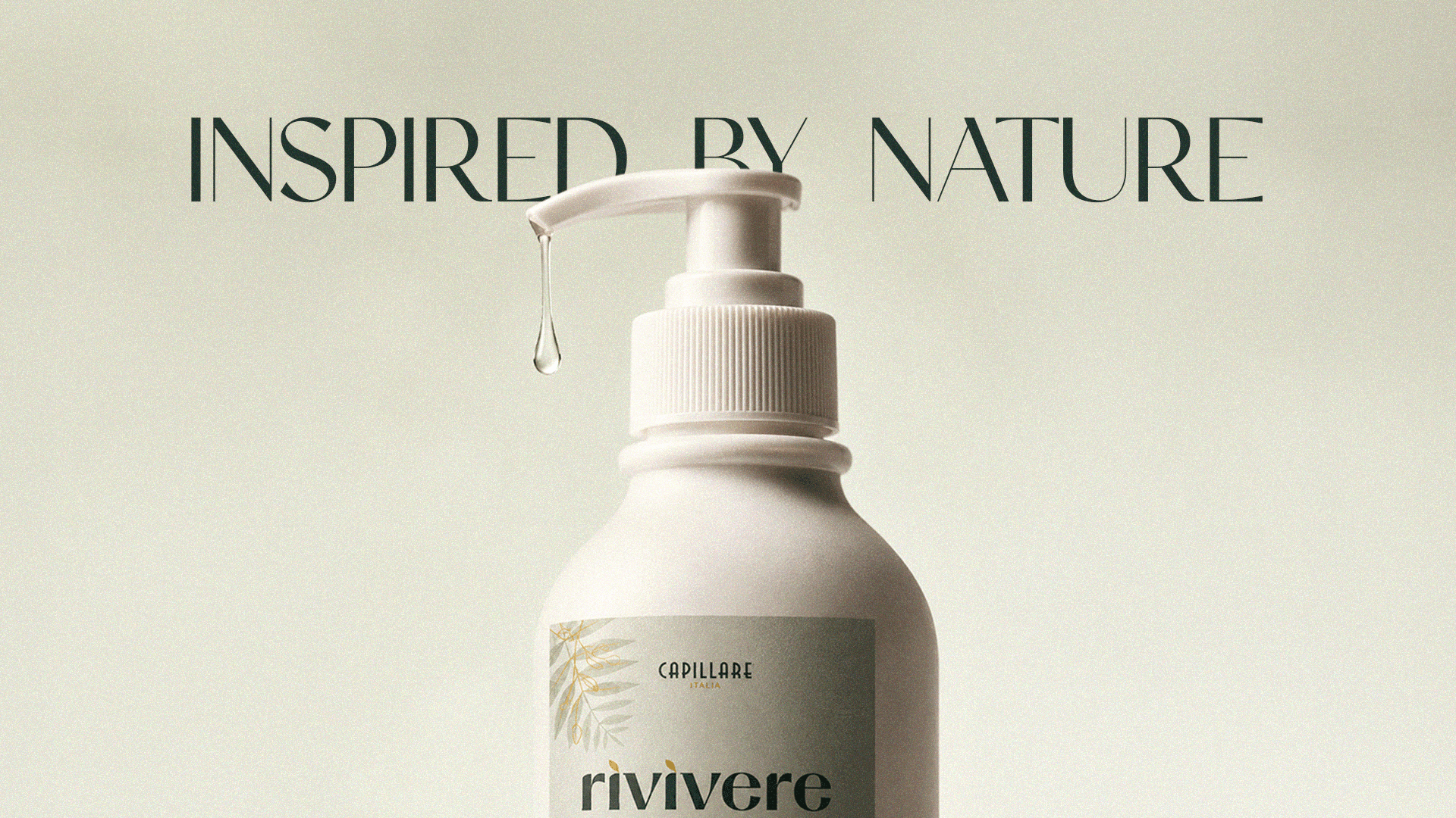
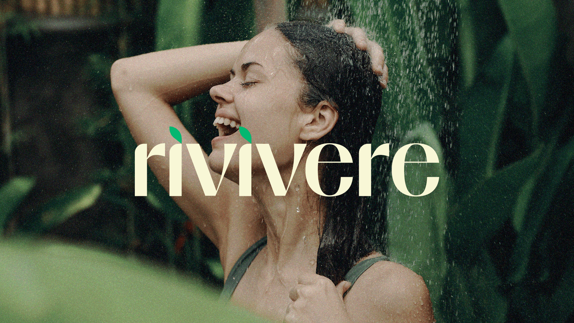
We repositioned Rivivere as a botanical well-being brand, crossing plant purity with the credibility of modern trichology. The visuals became cinematic: natural light, water, deep green and silence in the composition.
The serif typography and the restrained palette move the brand away from the naturalist cliché and closer to luxury skincare, which is where its real competition lives.